获取系统信息
首先在app.js中,增加以下代码,用于获取系统信息。
App({
    onLaunch() {
        // 获取菜单按钮(右上角胶囊按钮)的布局位置信息。坐标信息以屏幕左上角为原点。
        const capsuleObj = wx.getMenuButtonBoundingClientRect();

        // 获取系统信息
        wx.getSystemInfo({
            success: (res) => {
                const statusBarHeight = res.statusBarHeight; // 顶部状态栏高度
                this.globalData.capsuleObj = capsuleObj; // 右上角胶囊按钮的布局位置信息
                this.globalData.titleHeight = statusBarHeight + capsuleObj.height + (capsuleObj.top - statusBarHeight) * 2; //标题栏高度 = 状态栏高度 + 胶囊按钮高度 + (胶囊按钮上边界坐标 - 状态栏高度)* 2
            }
        })
    },
    globalData: {
        capsuleObj: null,
        titleHeight: 0
    }
})
自定义组件
在项目根目录下新建components文件夹,用于存放小程序的自定义组件。然后在其目录上右击,新建component,命名为custom-header。
index.js
// components/custom-header/index.js
const app = getApp()

Component({
    /* 组件的属性列表 */
    properties: {
        customTitle: String,
        bgColor: {
            type: String,
            value: '#fff'
        },
        fontColor: {
            type: String,
            value: '#000'
        },
        menuFlag: {
            type: Boolean,
            value: false
        },
        backHomeFlag: {
            type: Boolean,
            value: false
        },
    },
    /* 组件的初始数据 */
    data: {

    },
    lifetimes: {
        // 在组件实例进入页面节点树时执行
        attached: function () {
            this.setData({
                titleHeight: app.globalData.titleHeight,
                capsuleObj: app.globalData.capsuleObj
            })
        }
    },
    options: {
        multipleSlots: true, //启用多slot支持
    },
    /* 组件的方法列表 */
    methods: {
        // 菜单
        meunClick: function () {
            wx.navigateTo({
                url: '/pages/menu/menu',
            })
        },
        // 返回
        backClick: function () {
            wx.navigateBack({
                delta: 1
            })
        },
        // 回首页
        homeClick: function () {
            wx.navigateTo({
                url: '/pages/index/index'
            })
        },
    }
})
index.json
{
    "component": true
}
index.wxml
<!-- components/custom-header/index.wxml -->
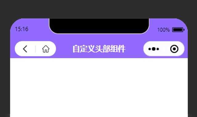
<view class="m-customheader" style="height:{{titleHeight}}px; background-color:{{bgColor}};">
<!-- 标题 -->
<view class="m-customtitle" style="top:{{capsuleObj.top}}px; height:{{capsuleObj.height}}px; line-height:{{capsuleObj.height}}px; color:{{fontColor}};">
{{customTitle}}
</view>
<!-- 菜单 -->
<view class="m-menubox" style="height:{{capsuleObj.height}}px; top:{{capsuleObj.top}}px;" wx:if="{{menuFlag}}">
<image src="/static/images/compontents/customHeader/customMenu.png" mode="widthFix" bindtap="meunClick"></image>
</view>
<!-- 返回+首页 -->
<view class="m-backhomebox" style="top:{{capsuleObj.top}}px; width:{{capsuleObj.width}}px; height:{{capsuleObj.height}}px; border-radius: {{capsuleObj.height}}px;" wx:if="{{backHomeFlag}}">
<view class="u-customicon" bindtap="backClick">
<image src="/static/images/compontents/customHeader/customBack.png"></image>
</view>
<view class="u-customicon" bindtap="homeClick">
<image src="/static/images/compontents/customHeader/customHome.png"></image>
</view>
</view>
</view>
<!-- 自定义顶部距离修正 -->
<view class="m-customwrap" style="height:{{titleHeight}}px;"></view>index.wxss
/* components/custom-header/index.wxss */
.m-customheader {
    position: fixed;
    top: 0;
    left: 0;
    right: 0;
    z-index: 99999;
}

/*菜单*/
.m-menubox {
    position: absolute;
    left: 10px;
    z-index: 11;
    display: flex;
    align-items: center;
}

.m-menubox image {
    display: block;
    width: 30rpx;
    height: 30rpx;
}

/*返回和首页*/
.m-backhomebox {
    position: absolute;
    left: 10px;
    background: #fff;
    display: flex;
    justify-content: space-between;
    align-items: center;
}

.m-backhomebox .u-customicon {
    flex: 1;
    display: flex;
    justify-content: center;
    align-items: center;
}

.m-backhomebox .u-customicon image {
    display: block;
    width: 30rpx;
    height: 30rpx;
}

.m-backhomebox .u-customicon:nth-child(1){
    border-right: 1rpx solid #e5e5e5;
}

/*标题*/
.m-customtitle {
    position: absolute;
    left: 0;
    right: 0;
    box-sizing: border-box;
    text-align: center;
    font-size: 32rpx;
    font-weight: bold;
    padding: 0 230rpx;
    overflow: hidden;
    white-space: nowrap;
    text-overflow: ellipsis;
}

/* 自定义顶部距离修正 */
.m-customwrap{
    position: relative;
    left: 0;
    top: 0;
    right: 0;
    z-index: 99998;
}
在页面中使用
首先在.json文件中增加以下代码
"usingComponents": {
    "customHeader": "/components/custom-header/index"
},
"navigationStyle": "custom"然后在.wxml文件中调用
<!-- 自定义顶部 -->
<!--
    menuFlag: 菜单
    backHomeFlag:返回+首页
    bgColor:背景色(默认#fff)
    fontColor:标题字体颜色(默认#000)
-->
<customHeader menuFlag="true" customTitle="首页" bgColor="#7ED1AC" fontColor="#fff"></customHeader>

